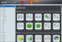
If you run the JavaFX Ensemble from the apps folder, it looks just awful. This is meant to be a showcase of Java FX and all it really does is put me off using it.
In the attached image you can see that the title text is cut off at the bottom. The Close, minimize and maximize icons are all misaligned. The text on the tabs (All, Samples, Document) looks awful when it is selected as well as when it isn't. The text in the tree doesn't look good to me (maybe I just don't like the way it is anti aliased, maybe it isn't anti aliased very well). The separators that separate the forward, back and refresh buttons go down too far and encroach on the component below.
In the attached image you can see that the title text is cut off at the bottom. The Close, minimize and maximize icons are all misaligned. The text on the tabs (All, Samples, Document) looks awful when it is selected as well as when it isn't. The text in the tree doesn't look good to me (maybe I just don't like the way it is anti aliased, maybe it isn't anti aliased very well). The separators that separate the forward, back and refresh buttons go down too far and encroach on the component below.
- duplicates
-
JDK-8113217 Ensemble: the separators for forward, back, and refresh buttons go down too far
-

- Resolved
-
-
JDK-8113242 Custom close buttons in Ensemble are offset in X from where they should be
-

- Closed
-
-
JDK-8113530 Ensemble All/Samples/Document buttons are cut off at the bottom
-

- Closed
-
