-
Type:
Bug
-
Resolution: Fixed
-
Priority:
 P4
P4
-
None
-
Affects Version/s: fx2.0
-
Component/s: deploy
-
Environment:
Windows
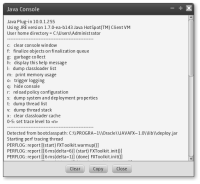
I know that the Swing/AWT version of the Java Console window has the buttons (Clear, Copy, Close) centered at the bottom of the window. However, for consistency, it would be better if they were flush right like all the other deployment dialog windows. Keep the same order, but move the Close button so it's right edge is 16 pixels from the right edge of the window.
