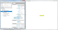
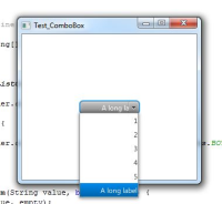
In a ComboBox skin, the "button" part skin extends underneath the "arrowButton" part. this is particularly evident when using labels that are aligned to the right (ie: when using complex ListCell instances, see attached screenshots) or when exploring the content of the combo using ScenicView.
The button and the arrow button should be aligned horizontally next to each other and not on top of each other as in the current skin.
The button and the arrow button should be aligned horizontally next to each other and not on top of each other as in the current skin.

