-
Type:
Bug
-
Resolution: Fixed
-
Priority:
 P4
P4
-
Affects Version/s: 6.0.0, 7.0.0
-
Component/s: Mission Control Client
-
generic
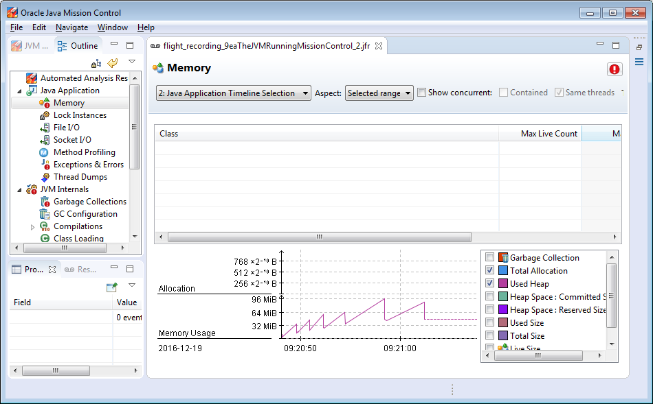
If a chart is empty (because there are no events), the values on the y-axis can be really ugly. For example in an Allocation chart, three values are displayed on the y-axis: 256*10^-10 B, 512*10^-10 B, 768*10^-10 B.
This makes the chart look a bit ridiculous.